Walmart Lightbox
Styleguide | Web Design | Marketing | Branding
This section is broken down in four parts; Styleguide, brand pages, onsite, and branding
Styleguide
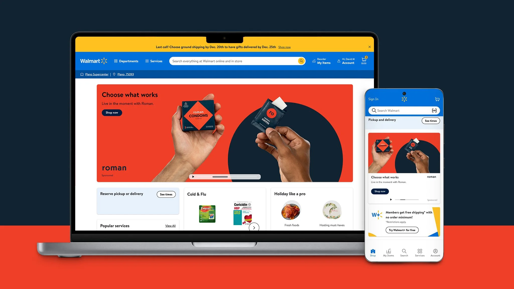
As Lightbox Creative keeps growing we started pushing our creative executions. We introduced elements that once was banned like typography, illustration, & B&W photography. With opening the creative floodgates, we created a guide to aid our designers & partners.
My role for this project was creating scenarios & defining design solves.
Previously our creative was product focused only. I noticed our ads were blending in with our traditional Walmart banners, introducing typographic elements gave our clients their voice and it was easier to notice. Instantly we started seeing more click-thru rates.
One thing Walmart didn’t touch was sexual awareness products like condoms, lubes, etc. The challenge was how do we explore these scenarios without over-sexualizing? While we were creating our guide Roman came along. Funny enough this was my client.
We focused more on their brand colors and messaging rather than the traditional “taboo” of displaying over sexualized models. A lightbulb went off and I thought we can apply this as a general rule for our guide. Pull brand elements like colors and voice, if we show body parts; use an artistic crop.
Brandpages
Brandpages are custom client landing pages that live in the Walmart website. This gives the client the space to promote specific campaigns or as simple as a brand hub-spots.. Sketching, concepting, and designing brandpages are a part of my daily duties.
Birds Eye
Frozen foods are seen as uninspiring and boring. I wanted to break away from that. For the hero banner an attention grabber was a must. My concept was; a farmer watching his crops grow. Placed the product like it was blooming from the fields.
Both Birds Eye and I wanted to show frozen veggies are just as good as fresh veggies. They have an interesting method of freezing their vegetables at peak freshness. My thoughts were after the carousel we have to emphasize on their freezing process. That is a huge selling point and also their mission.
Here are some more brandpages I’m proud of!
Onsite Campaigns
Besides brandpages, onsite banners are my bread and butter. Our team creates onsite banner ads that live all thru Walmart’s site.
Legacy: Here some of my fav banners before the new display sizes
Creative Certification Program
CCP teaches our partners how to use our templates and launch their own campaigns on Walmart.com. Lightbox wanted us to create a stamp & logo for the program. This is my execution.
My idea was an utilitarian stamp, big n’ bold. At first it started off as a the Walmart bug with type, but then realize we had to make CCP stand out. I also threw a wild card for fun.
Examples of pins & stickers
Final stamp of approval


